After the old studio burned, moving into our new digs was the start of a new chapter in Urban Influence history. We saw this as a perfect time to update our brand.
At the core of the new brand is the idea of the power of influence in branding. It is supported by the duality and contrasting strengths that fill our studio. Each component of the new brand contains a specific influence list, which highlights various things that can be influenced by branding. These lists change out of different pieces to correspond with the item or who might be giving them away. For example a Designer’s job may influence content, perception, typography and culture, while the Principle’s will have more influence on business, strategy, profitability, and action.
The concept of duality is shown in the contrasting sides of elements. One side is clean and subdued, while the other side is bold and active. The name Urban Influence crosses into both worlds showing that we have influence in either one.
The thick paper stock has been influenced by strong debosses and bold color hits throughout the system. And finally to stay true to our pioneer square roots, the pigeon graces each piece with a bit of UI history.
Business Cards
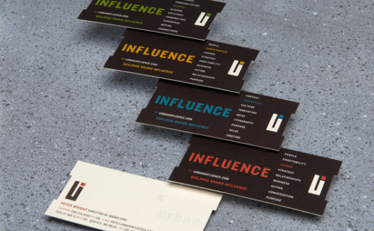
Cards feature a double deboss, duplexing and custom die cut. Each department is represented by its own unique color and influence list.
Stationery set
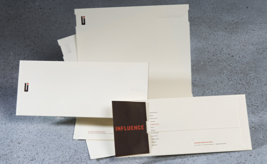
Features die cut notch, debossed logo and custom influence list on backside. System applied in different colors across different collateral pieces, letterhead, envelope, notecard, mailing label, CD label, and CD holders.
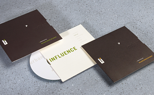
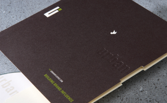
Work Book
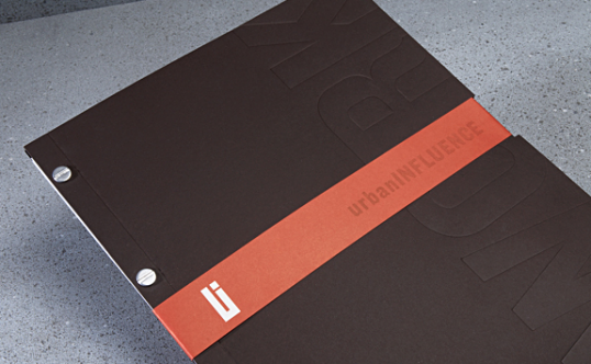
Work portfolios feature a large blind deboss of work while being wrapped in a bold red belly-band that fits into the notch die cut.
