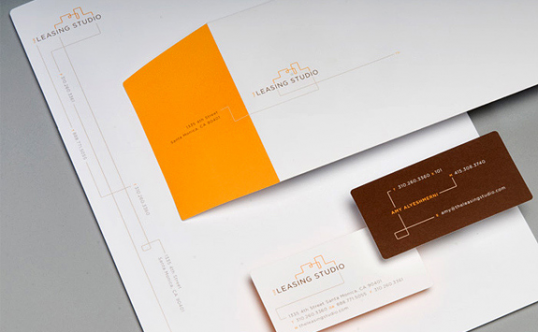
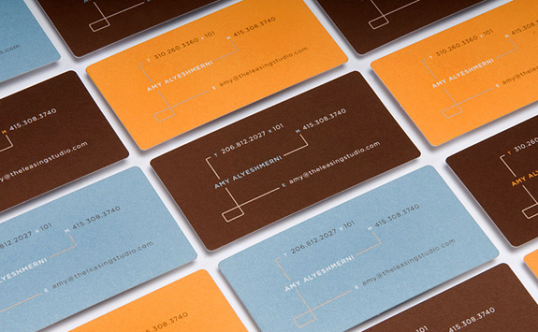
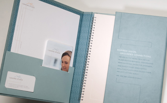
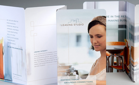
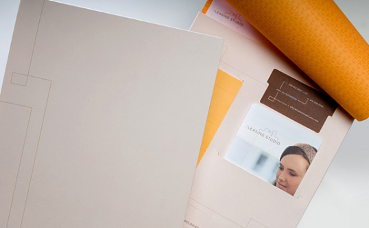
Vision, connection and retail magic are all superbly integrated in this modern mark created for The Leasing Studio. The clean no-nonsense typeface successfully portrays a sense of looking towards the future. The progressing line extending above the two i’s creates a bridge between the two words and echoes building structures. The Leasing Studio’s whole brand language evolved from the ethos contained in this one mark.
