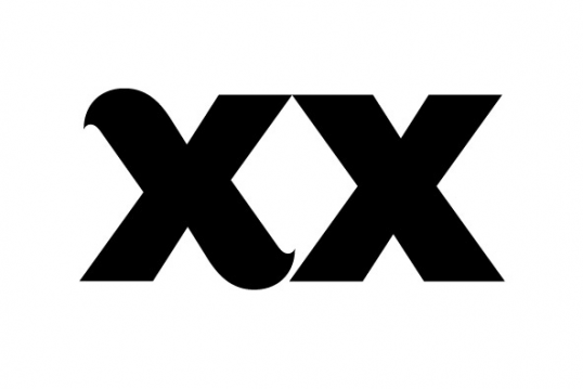
Lovin' this font right now, Augustus by Karl Frankowski. A must purchase. Here are some choice words from YouWorkForThem reagarding the font.
Augustus is a hefty sans serif that combines classical humanist elements and precise geometry. With racehorses and typography, lineage is everything, and Augustus is from good stock. Karl Frankowski paired the charisma of Morris Fuller Benton’s Eagle Bold with the flair of Zuzana Licko’s Dogma. The trained eye will detect a sprinkling of 19th century wood type in there as well. He named Augustus after Augustus Gloop, that alarming glutton of a child infamously expelled from the Chocolate Factory.
Five years is a maddening amount of time to spend developing a single-weight typeface. That is how long it took one Karl Frankowski to release his first commercially available typeface and the attention to detail really paid off.
Augustus is now a complete international character set with a gang of whipped alternates. A half decade ago, however, it was 26 uppercase letters designed for a one-off poster. After hundreds of rounds of refinement, the rationalist that lives deep inside surfaced, and he developed a less flamboyant form for broader applications. It should be noted that this is no story of compromise. In the years since he began Augustus, the opentype font format took hold, which enabled him to retain the original swash characters as stylistic alternates. Augustus is available in OpenType format for Macintosh or PC.
