Sometimes the simplest design wins. Well, actually most times, at least for me. I love it when design speaks to me in the minimalist way possible. Here are a few of my favorites at the moment. These pieces have that delicate balance that I enjoy most about design. I can pull plenty of examples but think these are most current in my mind.
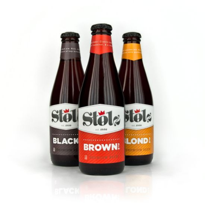
The first piece is a concept for a brewery based out of Baltimore, MD, and was produced by Julian Baker. It focuses on hand-crafted, European-style beer named Stolz, which is a German translation of the word 'proud'. I love how bold and direct these labels are and the choice of color is spot-on. The top labels with the angle pointing downward is a nice solution to the traditional wrap-around label.
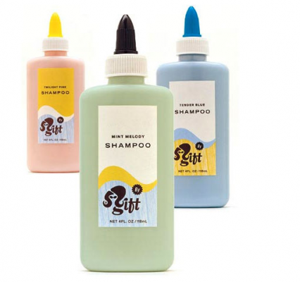
The next pieces from Mint Design are Shampoo 'bottles' made by Gift. I love the repurpose of the Elmer's glue packaging and the nice use of white space to clearly convey each message. The colors are great and the logo is really fun.
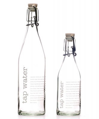
Tap Water, designed by Racquel Youtzy, created this in response to the growing demand for safe refillable water bottles. These simple and beautiful bottles have both a vintage and modern appeal, and are guaranteed to look stunning in any dinner or kitchen setting.
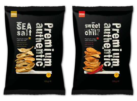
Next up is packaging done for Hema Premium potato chips, designed by Studio Kluif. These packages are amazing. I believe they even hand stamped the letters to match the feel of the old wood crates that were used to transport vegetables and fruit. I love the use of black against the crisp photography. It makes me want to go out and produce my own potato stamps right now.
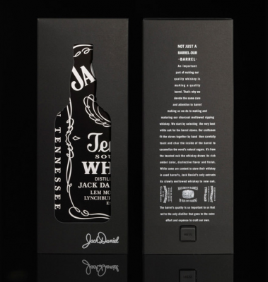
Lastly, this packaging for Jack Daniels is simplicity in it's finest, to me. Designed by Mayday out of London. It brings a whole new light to the bottle itself. It just makes you want to open the package, even if you don't enjoy drinking Jack Daniels.
That is all for now, but stay tuned for more mind-blowing simplistic packaging soon.
