[lwegallery]
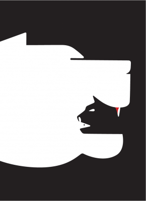
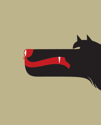
I have am a big fan of minimalism. The ability to take a complex thought, boil it down to its purest, most simple form and still communicate the complexity of issue with clarity has always fascinated me. I also really enjoy the visual wit and power of positive and negative shapes in illustration and design. I just came across a piece by Noma Bar that stopped me in my tracks, because it does both. I find his work to be powerful and a great example of how bold messages can be communicated clearly with simplicity.


.png)
If you want to find out more on Noma, there is a great interview with him over at grain-edit
