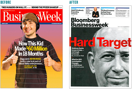
We're begining to see some desperate flailing from printed periodicals as they try new ways to survive the consumer's mass exodus to interactive content. Apparently Business Week has decided that if you can't beat 'em, you might as well join 'em (sort of). Going with classic helvetica as their primary typography choice and a tightly packed composition, their latest redesign is a bold nod to interactive design both in aesthetic and hierarchy.
Maybe the average consumer's sub-conscious will register this as more relevant than print, however my 2 cents is that they'd be better off rethinking their content distribution model. As more people migrate to digital distribution for news, knowledge and entertainment it will become paramount to innovate in this space rather than beat a dead horse with a sack of old magazines.

