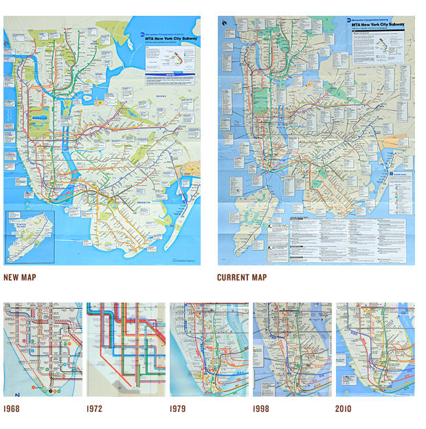
Maps have always been interesting, especially to designers. There is so much information that needs to be put into maps, regardless of what they are for. With so many little icons, words, and markers it can be easy to confuse viewers and create more of a navigational problem than if there was no map at all. As designers, it can be the greatest test of our skill and knowledge, and in many ways is a perfect example of how design works.
I recently came across an article covering the new redesign (or more of an update) to the current New York subway map. Covered somewhat thoroughly on the New York Times website is a history of the map and how it has changed since 1939. The most memorable will surely be Massimo Vignelli's design in 1972 which puts the focus clearly on the lines themselves, or as Vignelli puts it: "The only thing you are interested in is the spaghetti."
Unfortunately this map didn't last long, despite it's similarities to the effective London Underground map, established in 1933 by Harry Beck. Commuters had many troubles deciphering the map due mostly in part to the geographical liberties taken by Vignelli. In 1979 the stylized design of the map was dropped for a more geographically correct version, which is still the basis of the current and updated map. Other additions that are most notable were the change of parks and water to colors that clearly reflected what they were: green and blue respectively. A street grid was also finally added in. In 1998 the map was again updated to reflect the free bus transfers from the subways stations introduced the year before. Also included were ferry connections to New Jersey, and Staten Island finally made an appearance. Now, over a decade later the map gets a new update. There are several new additions and changes that are highlighted by the article.
Viewing the map in it's entirety next to the current map it is easy to see a big improvement in clarity. The color change definitely helps with this, brightening the blues and pushing the emerald green of the parks to an olive color, which helps differentiate it from the color of the water. The change that most contributes to the improvement in readability is the exaggeration of Manhattan's width. In the new map, the island is 83 percent wide that its actual proportions, growing 31 percent from its current state. This opens up a lot of room to fit in all that information. One other significant change is that shadows have now been added to the subway lines for added clarity, and to help make them stand out. Looking at the many details I'm worried that this may in fact detract from the readability of the lines. There are several other smaller changes, like a tightened up street grid that contributes to the overall improvement.
Overall this is a nice update to what is an incredibly interesting piece of design. However, it's unfortunate that Vignelli's map could not have been improved upon to a solution similar to Erik Spiekermann's 1992 Berlin Subway Map, as the style is both much more aesthetically pleasing and legible.
