
From Commercial Type:
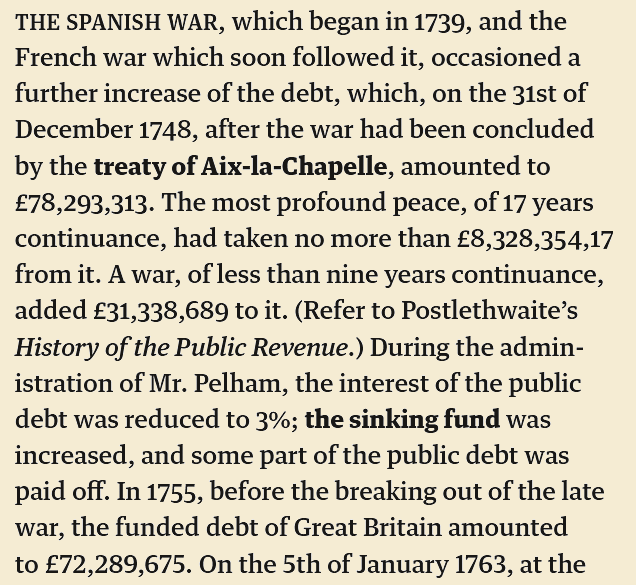
What happens when you try to make a new sans serif by chopping the slabs off of an egyptian? That was the original inspiration behind this modern classic designed for Mark Porter and the Guardian newspaper. Comprised of several interrelated families: Sans and Egyptian for headlines; a Text Egyptian; and an Agate Sans, every possible typographic need of a daily paper is fulfilled. Serious news headlines, expressive features, readable text, tiny financial listings, info graphics, and everything in between can be capably handled with ease.
Designed by Paul Barnes and Christian Schwartz, 2009.
