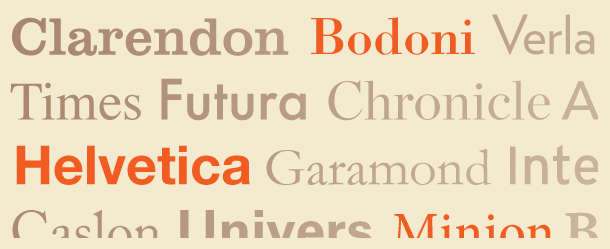
I recently read a post by John Boardly on ilovetypography.com that was written in response to an interview of Massimo Vignelli on bigthink.com. In the blog post, the writer focuses on Vignelli's claim that any good designer really only uses 12 fonts. Boardly makes some excellent points on why 12 fonts, while perhaps enough for a single designer by preference, is not nearly enough for the world, and can hardly be considered the measure of a good designer. He goes on to imagine a world in which everything around us has been set in a limited type-palette.
Boardly talks about how we, as a species, are constantly evolving, finding new solutions to design problems and uses this as his main argument as to why we continually move forward with type and are never satisfied with a small selection. He then goes to talk about Vignelli's mentioning of the Industrial Revolution, when an explosion of typefaces happened. Vignelli talks about a large problem occurring here because type designers convinced advertisers that each client needed to have their own typeface, while Boardly describes it as the demanding of new typefaces by advertisers, etc. Whatever the case may be, there was a supply and demand, or at least a supply and consume.
Taking a look at today, we have literally thousands of typefaces to sift through, and as Boardly puts it, many of them we would most likely be better off without. I agree very much with what he talks about in his response, but there are also several additional ideas addressed by Vignelli in his interview that have merit. The reasoning he gives for the importance of using a limited number of typefaces is to imagine playing an instrument; you become better and better with one type of instrument the more you practice, and eventually you learn to master the skill…but it takes time and experience. This has a lot of truth behind it, and is something designers should consider.
A similar article, written by Michael Beirut for the Design Observer also talks about the subject. His first ten years into his career he actually worked under Massimo Vignelli and drew from a selection of basically five fonts. He goes on to talk about after leaving that job, after a wild binge on some projects, he learned to not limit himself to a small selection, but rather to look at the offering of fonts and being discriminating, look at the circumstances and find good, solid reasons for choosing a font for a client or project. Beirut also points out that some fonts, when used too much, soon begin to remind people of something in particular. Using Frutiger as an example, it has, most of its life been used as airport and hospital signage. Many people may now relate this typeface to this, and in some circumstances this could have negative side-effects. To learn more about his opinion on the subject, and the 13 things to consider when choosing a font, read the article here.
The topic of typeface selection has been frequent discussion of designers over many years, and will likely be something talked about, probably more-so into the future with even more and more fonts being designed. I have met designers on both sides of the fence, and believe taking a stance in the middle is best. It is important to become experienced with certain fonts, to know more thoroughly how they function and can be used. But, being in the business of Branding, it is of the utmost importance to find the right voice for a client or business.
