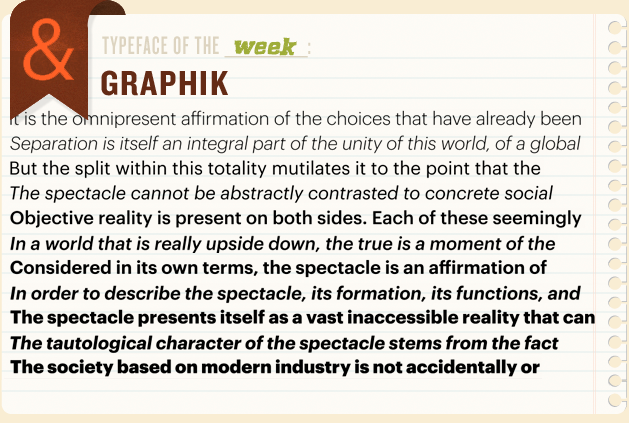
At first look, Graphik may look like just another mid century grotesque san-serif. But upon closer inspection, it is easy to see the influence of similarly aged geometrics. This lends a touch of friendliness to the typeface, which helps it stand apart from it's peers. Obvious similarities will be drawn to Helvetica and like-minded grotesques as well as the roundedness and relatively high x-height of Gotham, and to be fair Graphik borrows from both which result in a playful, fun, but always serious typeface. Put simply…this looks like a lot of fun to use and I'm excited to try this one out in the future!
Commercial Type is the foundry behind this work of art, and though they may have a smaller offering they make up for it in uniqueness. Giorgio has caught my eyes in particular a number of times…
