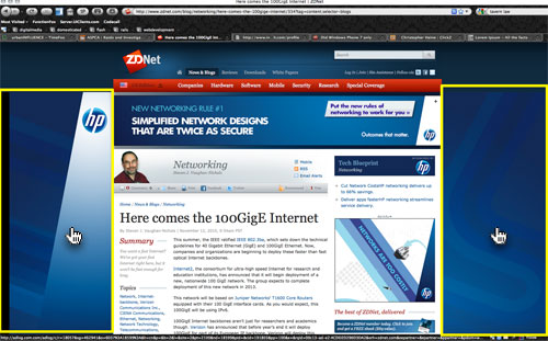
I suppose we all have our pet peeves when using the web, but one recent trend I've found particularly annoying is the gimmicky use of negative space in advertising. In the image, above, the obnoxious yellow regions of the photo represent a clickable area for an advertisement. Notice that this region takes all the remaining negative space in the page, essentially making this entire area a clickable banner. This clickable region extends all the way down the page – even when the HP ad is completely hidden from view.
What's annoying about this? For most people, the mouse pointer is the primary tool used for navigating the content of a page. Like my dog using his nose to find hidden treats underneath my couch, I use my mouse to discover things I might find interesting. An important part of user experience design is setting expectations for the website user. When the user sees an anchor link or title image, clicking it will take he or she to a different location. This is a common expectation across all online experiences.
But what happens however if I'm attempting to click on the scrollbar for this page and my uncoordinated finger misses the left edge of the scrollbar by a couple of pixels? In most website experiences, nothing happens. In this experience however, I'm immediately taken to an advertisement page – which is the exact opposite of what I wanted to do. In a similar vein it is a common practice for users to have more than one application open at a time. What happens if I'm trying to bring my web-browser window into focus so I click on what looks like an empty area of the screen to set my browser to my active window. If the window is already focused, a common mistake that I personally make when switching applications, this misdirected click will also take me to an ad page and away from the content I wanted to actually read.
Negative space is a usability aid, not an advertising opportunity. </rant>
