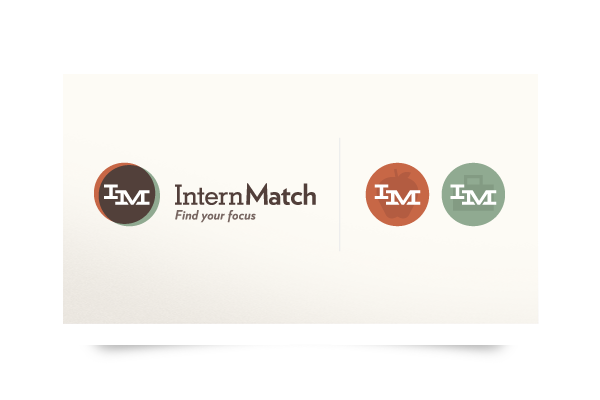
Please welcome the new face of an exciting and revolutionary project we've been working on for the past few months: InternMatch. The company is just beginning and came to us looking to find the right voice and a creative brand that will propel them forward into the future. This logo is just the beginning of an incredibly deep interactive experience.
A lot of research went in to creating a logo that expressed them as a company, what their mission was, and captured the two primary audiences they will be reaching out to; Students and Employers. The icon represents the connectivity and emphasizes mutual growth; two strong foundations the brand is built on. The logo further extends into two accompanying icons, representing their appropriate section.
We're excited to be a part of this great project, and can't wait to bring you more of it. Stay tuned!

