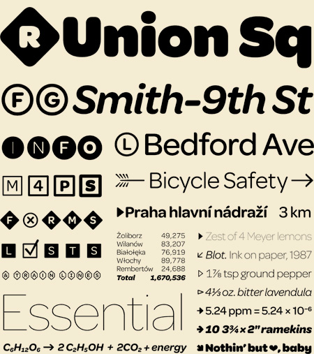

Hello! It’s been a while since we’ve done a Typeface spotlight, so here is last month’s choice, Omnes Pro. It was designed by Joshua Darden, with help from Christian Schwartz, Jesse Ragan, Thomas Jockin, Noam Berg and Scott Kellum. I love the simplistic look of this typeface, very editorial with a playful twist. Think Gotham with more personality. Sutble rounding adds nice texture and a 19th-century Grotesque feeling. It’s extremely easy to read, even with the high x-height, and a perfect addition to the ever-growing list of typefaces we love and admire.
