How do you bring elegant design to a B2B site? How do you craft straightforward messaging for a sophisticated enterprise audience? These were two of the challenges we faced when we started working with Polaris, a leading provider of software and services for global mobility programs.

We started the project by diving headfirst into the industry – interviewing current clients and non-clients alike. The interviews provided us with a knowledge base for the industry and the way Polaris was perceived. It was also a good reminder that even a B2B project is about communicating with people. It’s not a monolithic entity that visits a website or reacts to a logo – it’s a person or a team of people.
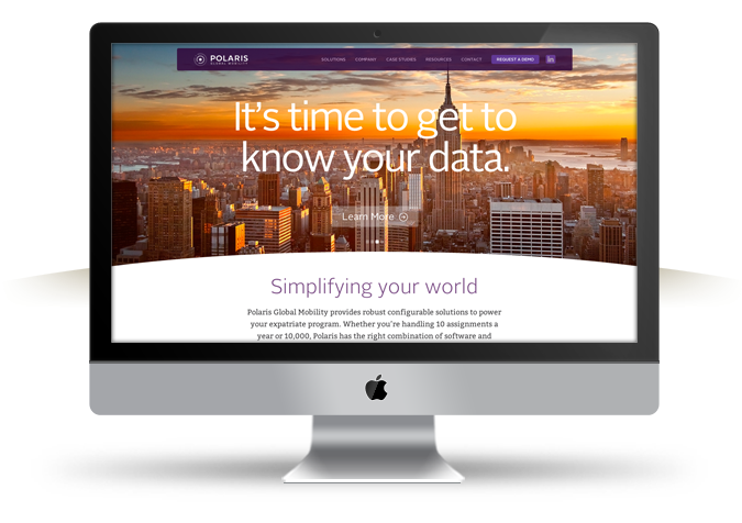
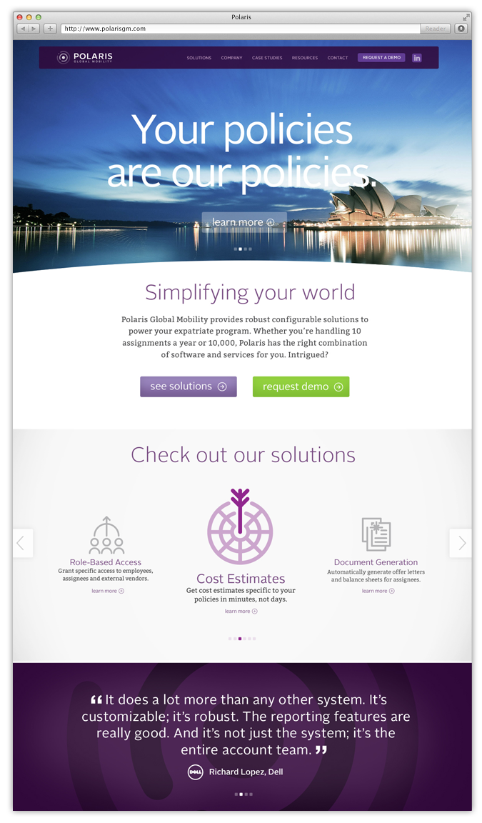
We took that to heart with the redesign of the site (www.polarisgm.com). Rather than just showing the technology, we tried to capture the excitement of employees moving around the globe by using inspiring cityscapes as a focal point.

We also created a new icon set to present Polaris’ varied offerings in a clean and simple way.
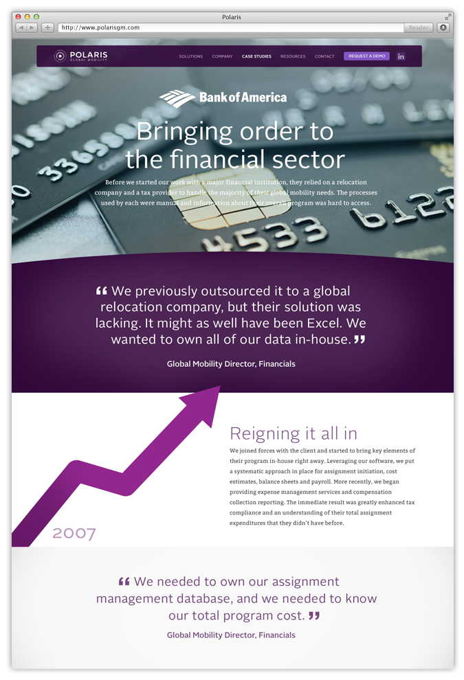
When it came to messaging, we spoke straight to the pain points that global mobility managers encounter every day. Big headlines address known issues and give the brand a relatable and knowledgeable voice. We carried this conversational tone throughout the rest of the copy, while still providing needed technical details on second- and third-tier pages.
In parallel with the website, we designed a trade show booth that utilized the same brand language. Along with a new logo and company name, we can truly say we’ve revolutionized the Polaris brand. It only seems fitting for a company that is revolutionizing global mobility management.

