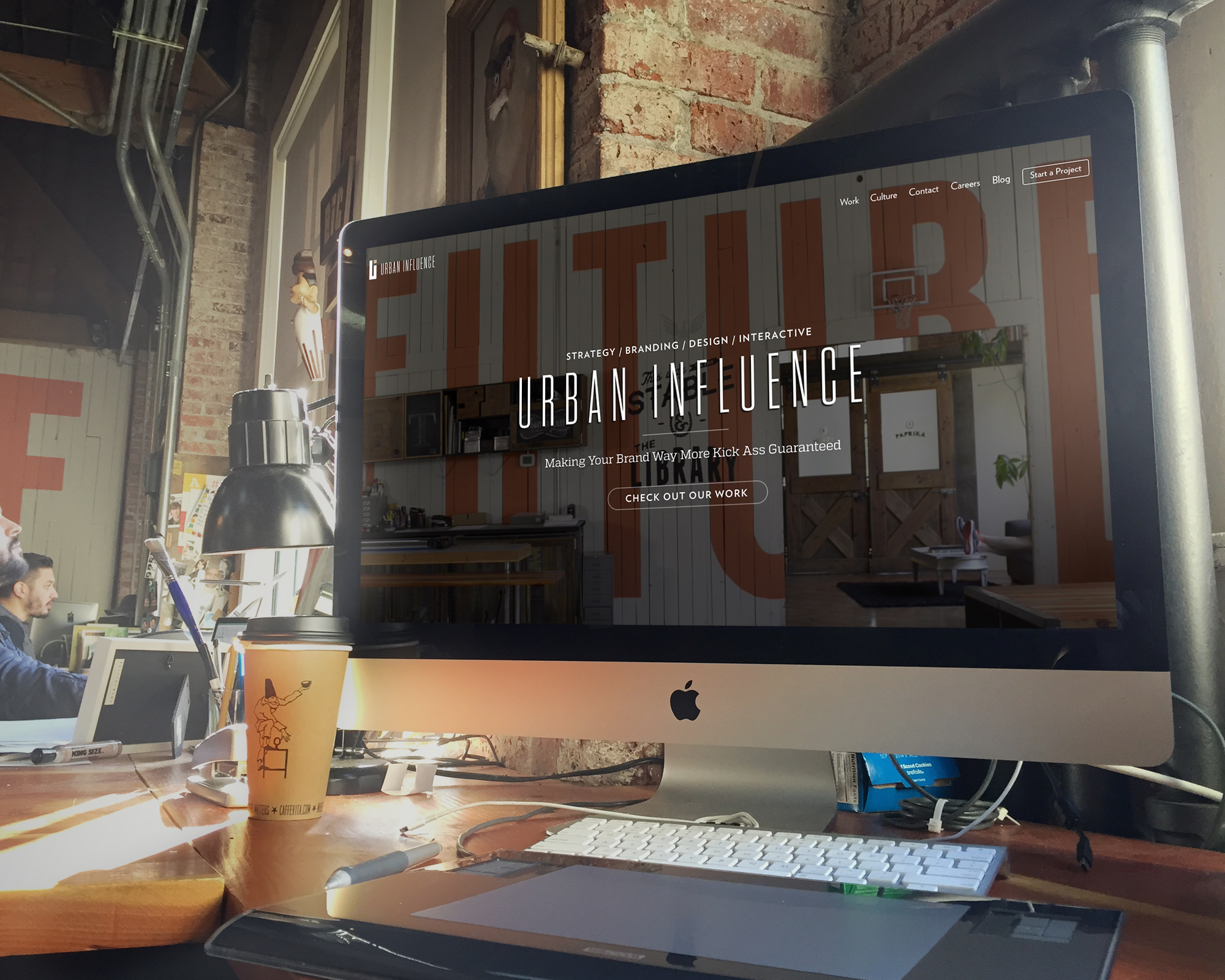
You know the moment in the pop culture cinema classic where the girl with glasses descends onto the dance floor under the collective gaze of her once-inattentive classmates – and she’s radiant?
Yeah. That’s us. Now.
Over the past six months we’ve crafted over 5,000 graphic elements, amassed over 1,000 original images, and written over 10,000 lines of code in support of this moment – welcome to the new online space for Urban Influence.

Rebranding the brand for branding
Our brand revival began with an audit of the Urban Influence identity; an earnest, full-force assessment of our visuals and verse – how we are represented in digital and print mediums, and more so, how we want to be received.
And while this appraisal process is one performed by our team time and time again, commencing a brand audit for a company in which you are embedded presents some interesting challenges and exciting opportunities.
![NewSiteInfographic[6]](http://www.urbaninfluence.com/wp-content/uploads/2015/01/NewSiteInfographic6-850x311.jpg)
We knew entering the effort we wanted to provide viewers a portfolio-centric experience showcasing the breadth and depth of UI client work. With over a decade under our belt, it’s a lot of content. And in an industry where you are what you do, demonstrating the ‘do’ was necessary to clarify the Urban Influence brand and client product.
Design + display
The team wanted to maintain an aesthetic that reflected our personality, while still highlighting client work. We paired reserved, poignant project visuals with a robust voice to convey the dynamism of our team through descriptions of the UI branding process.

Moving away from a broad collection of colors and typographic options to further complement client work, we employed cool neutrals and a clean triad of fonts that work as well in print as they do on the web.
And speaking of visual presentation – the new Urban Influence website was built against mobile-first design standards, so it displays with pixel-perfect clarity on any device, on your browser of choice.

A comprehensive audit demands looking into the past in addition to the future – we dusted-off older portfolio work for a two-week-long photography marathon to document earlier efforts. Then we tackled the voice, figuratively.

Voice
The text-centric experience of Urban Influence remained the same entity, just a bit older, a bit wiser, and in the process, more self-aware; we’ve graduated from college and discovered the concept of ‘more for less’ extends beyond ramen noodles and cheap fruit-tinged clear beers. While some of our case studies are lengthier, our overall copy content is more definite and distilled, and ultimately, we hope you’ll feel enticed to engage your communication device of choice to contact us.
Let’s talk
And on that note, we restructured how we connect with people. We now offer a project starter form in addition to a general contact request form. While some potential clients are at point one-of-ten in the agency discovery phase, others know precisely what they want and how they want it – our contact process accounts for this.
Do let us know
As you peruse our online goods, please let us know if you find issues along the way.
Alternatively, if you’d find pleasure in heaping praise upon us for our design / content / impressive beards and / or love of all things Swazey, we’ll shamelessly amass as many compliments as our in-boxes can handle.

