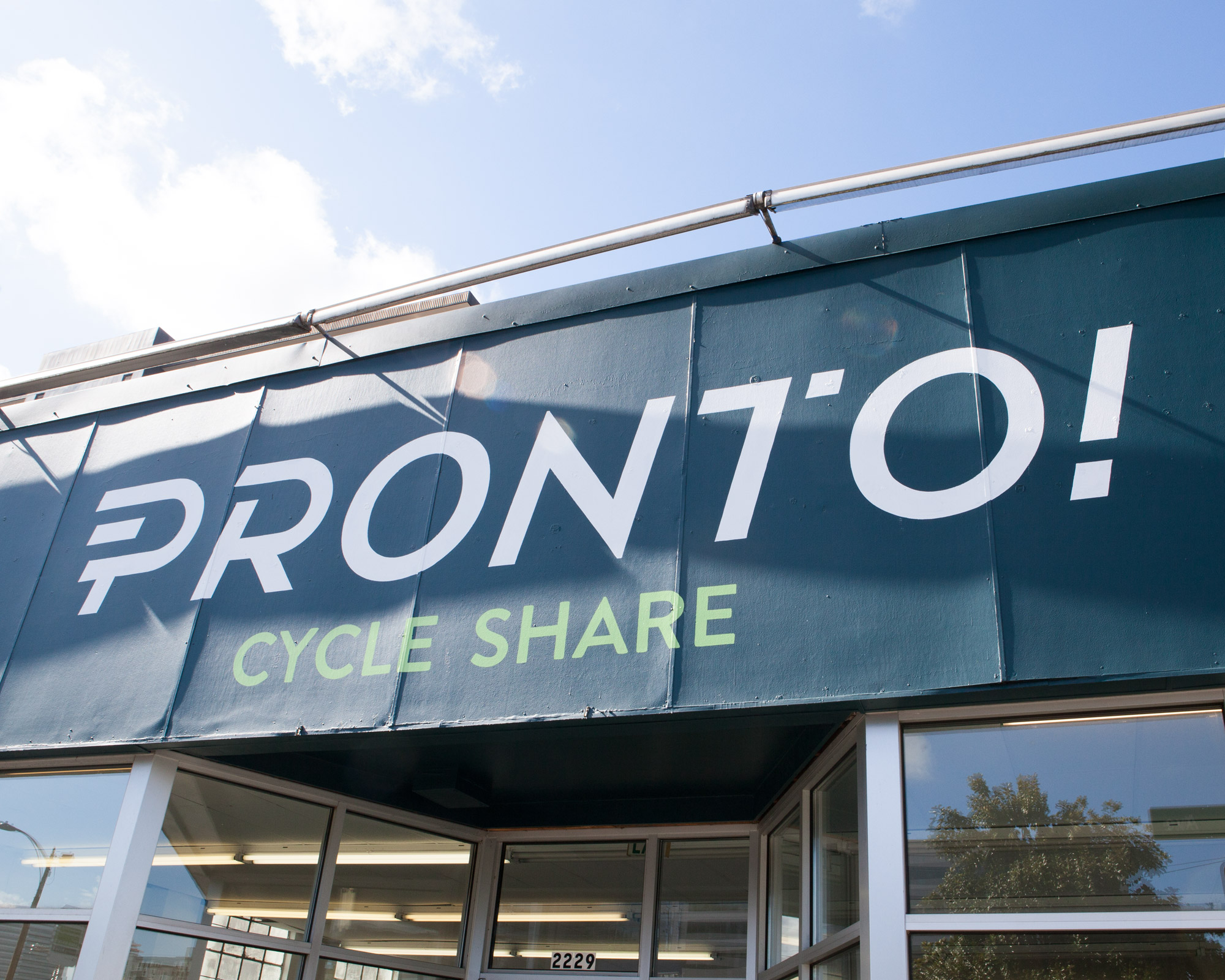
If you live in Seattle, you’ve probably seen Seattle’s new bike-share program, Pronto roll out (and rolling around) over the past several months. It’s a brand we established and couldn’t be more proud of, and it’s being operated by an awesome team of passionate individuals.

Building upon the beginnings of our stylized Seattle landmarks – all part of the bigger Pronto brand – we decided to use the length of the building to create a Pronto-branded Seattle-scape, complete with plenty of recognizable graphics. This design had two goals though, the first being to just look sweet (obviously), and the other to help establish some privacy for the office. We had a pretty big template to work with, across almost floor-to-ceiling windows but also needed to make sure plenty of natural light still worked it’s way in.


We couldn’t be happier with the results! Also a big shout-out to Casey over at Pronto for constructing and installing the interior portion of the display, which connects the window graphics on the corner of the building and creating a display for the Pronto bike.


