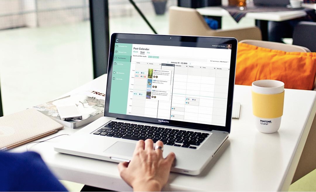
Cinchshare came to us looking for a new brand, a web app, and custom code that they could implement for their social media sharing platform.
The founders had originally built the site and software just for themselves; with a thriving at-home business, they relied on social media to spread the word and boost their sales. But managing social media was taking time away from, you know, the actual business of their business as well as their home life.
So they built their own solution. Enter Cinchshare, a web app that makes it easy, breezy simple to schedule and manage social media posts.
They intended to use it just for themselves, but once they showed Cinchshare to a few people, it turned out to be a hit with other at-home entrepreneurs. Suddenly they found themselves with a growing user base and needing an online presence and brand that matched up with their burgeoning success.
They were looking for something effortless, lightweight, and approachable that a busy at-home salesperson would see as a perfectly perfect addition to their self-run business support system.
So that’s just what we did.

Building the brand strategy: simple, free, together
Cinchshare makes social media management, well, a cinch.
Making that clear mattered a lot when it came time for strategizing, since the target audiences we identified for them were the kinds of people who didn’t have time or interest in complicated social media technology. We’re talking moms, dads, weekend warriors, and part-timers with day jobs. People who needed social media to stop taking so much time, plain and simple.
Above all else, Cinchshare needed to be approachable. A pleasant surprise. A friendly voice saying, “This doesn’t have to be painful. It might even be fun.”
We did in-depth research and analysis of the company and their customers, and created a solid brand foundation based on core principles that mattered the most: simplicity, community, and freedom. With those key touch points in place, we let our imaginations run wild. We chose bright, refreshing visuals and began outlining copy, images, and interfaces that would speak their language.
Creating a great SAAS interface and a killer toolkit
What does the busy at-home entrepreneur need? A better question might be: what don’t they need? Providing a bountiful toolkit with tons of options for users was a no-brainer.
For Cinchshare users, the interface needed to be intuitive and dead simple, and we figured while we were at it, we might as well make it pretty too.
We focused on making it easy to find and do the most important things like:
- uploading images
- cross-posting across social media platforms
- filters for directing posts to custom audiences
- calendars and scheduling tools
and most importantly:
- scheduling posts to go out in the future (so users can step away from the computer and get back to the work they actually want to do).
All this functionality needed to be wrapped up with a tidy bow so as not to overwhelm, so we tucked it all inside a mellow color palette with smooth-as-silk navigation.

Delivering a beautiful home base: the new cinchshare.com
What’s the point of a beautiful brand if no one can find it? Cinchshare needed a website where they could show off their product and entice new users to come aboard.
We took the principles that had guided their entire brand build and sprinkled them all across a site that simultaneously mirrored the colors, icons, and navigation of their brand spanking new software.


