Watson
Building a Site for the Builders
Watson is high-end furniture producer that designs and manufactures distinctive products for discerning customers. We built them a site that matched their level of craftsmanship.
Services
- Strategy
- Web Design + Dev
- Video + Photo
Industries
- Craft
- Design
- Furniture
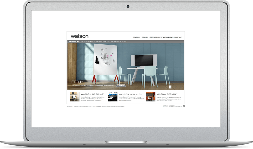
The Client Came To Us Asking For A Simple Website Redesign
That Watson needed a new website was obvious. It was a relic. Not quite Space Jam old, but still of an era where touch screens were only in movies, the Internet only came in seven fonts, and designers believed that clicking was better than scrolling.
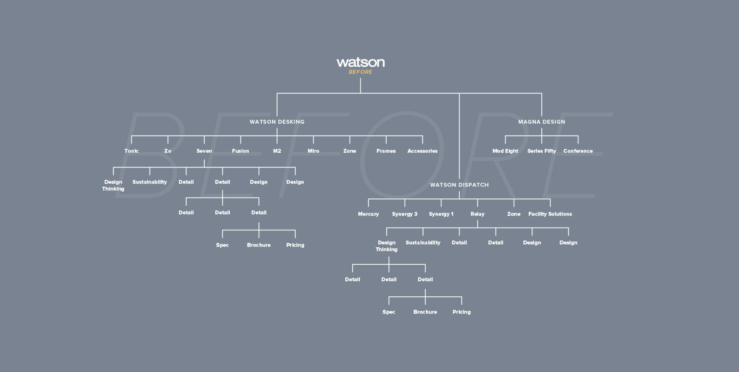
Old Sitemap
The design challenge with Watson was to simplify a labyrinthine collection of related product offerings into a clean user experience in a way that was organized but still visually engaging.
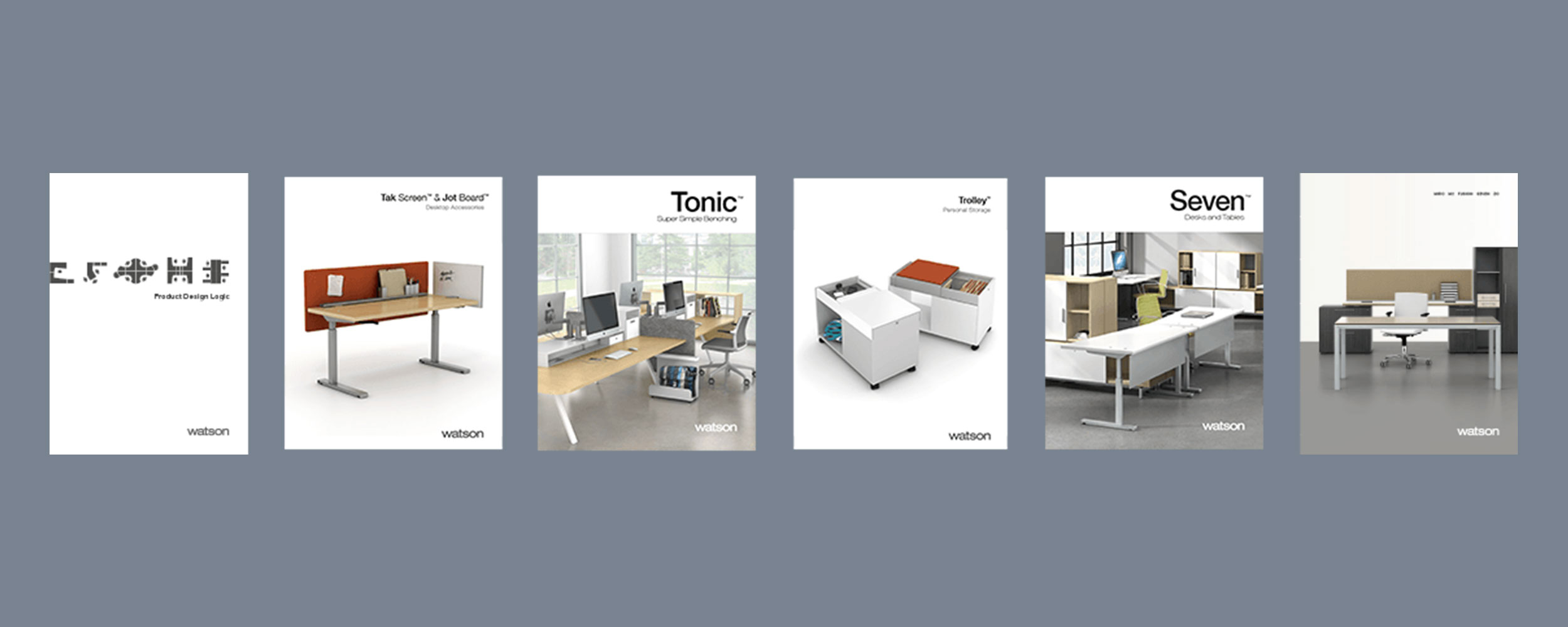
Studying the Company
We combed through every piece of Watson literature we could find: the entire website and all of their brochures—even their 412-page comprehensive price list—to find out exactly what information would be relevant to Watson’s customers so we could structure the site accordingly.
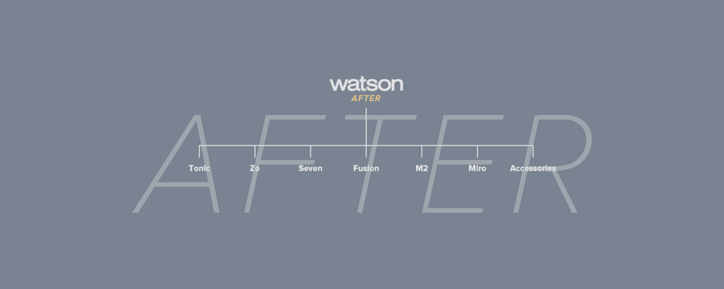
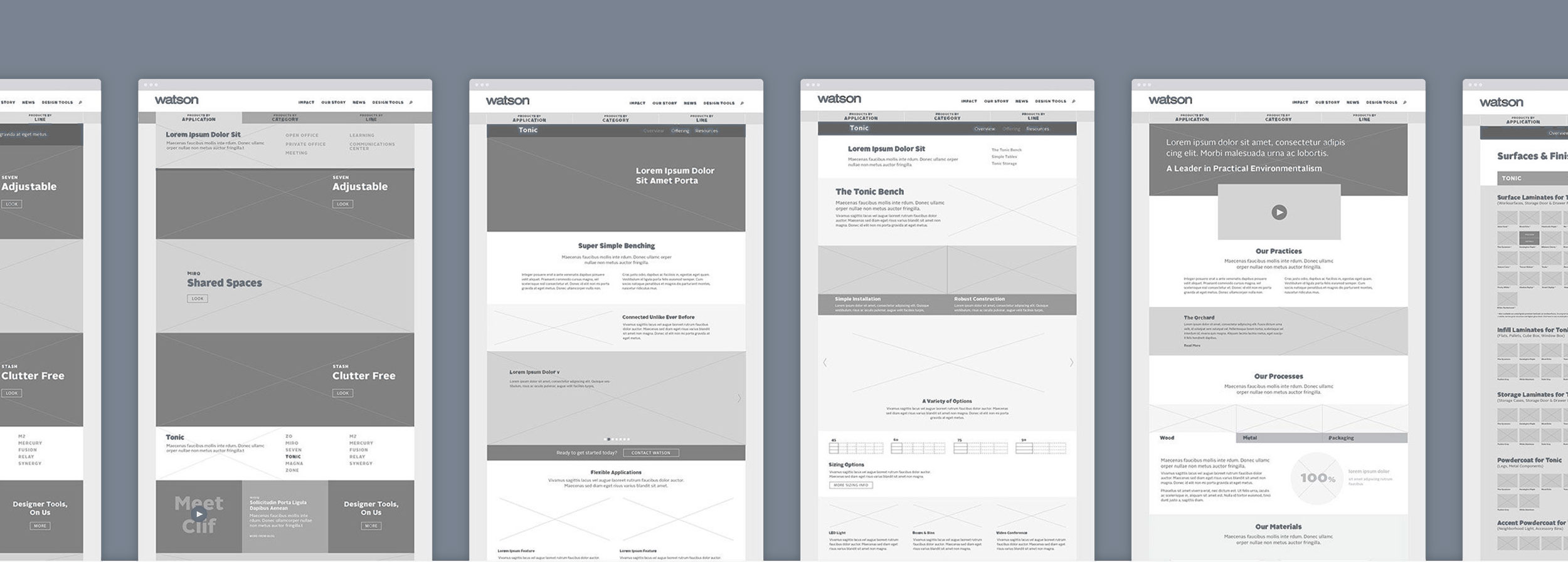
A New, Simple Structure
Looking at our now encyclopedic knowledge of Watson through the lens of their customers’ needs, we developed an organizational strategy to govern the creation of a site map and help Watson restructure the way they thought about their own products.
Laying the Foundation
We pushed a unifying, long-form experience with cleanly structured page sets for each line, establishing a narrative that highlighted their beautifully designed furniture and made important technical information accessible at glance instead of buried in downloadable documentation and hidden content.
Putting People First
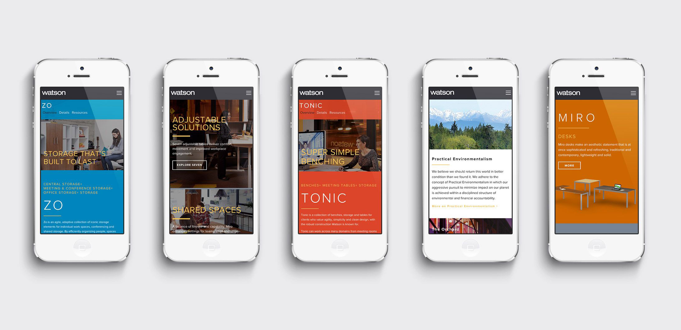
After all that research, creating the verbal and visual foundation for the brand was a matter of simply balancing their commitments to sustainability and the environment, human dignity, and financial stability, with their innovative approach to design and building.

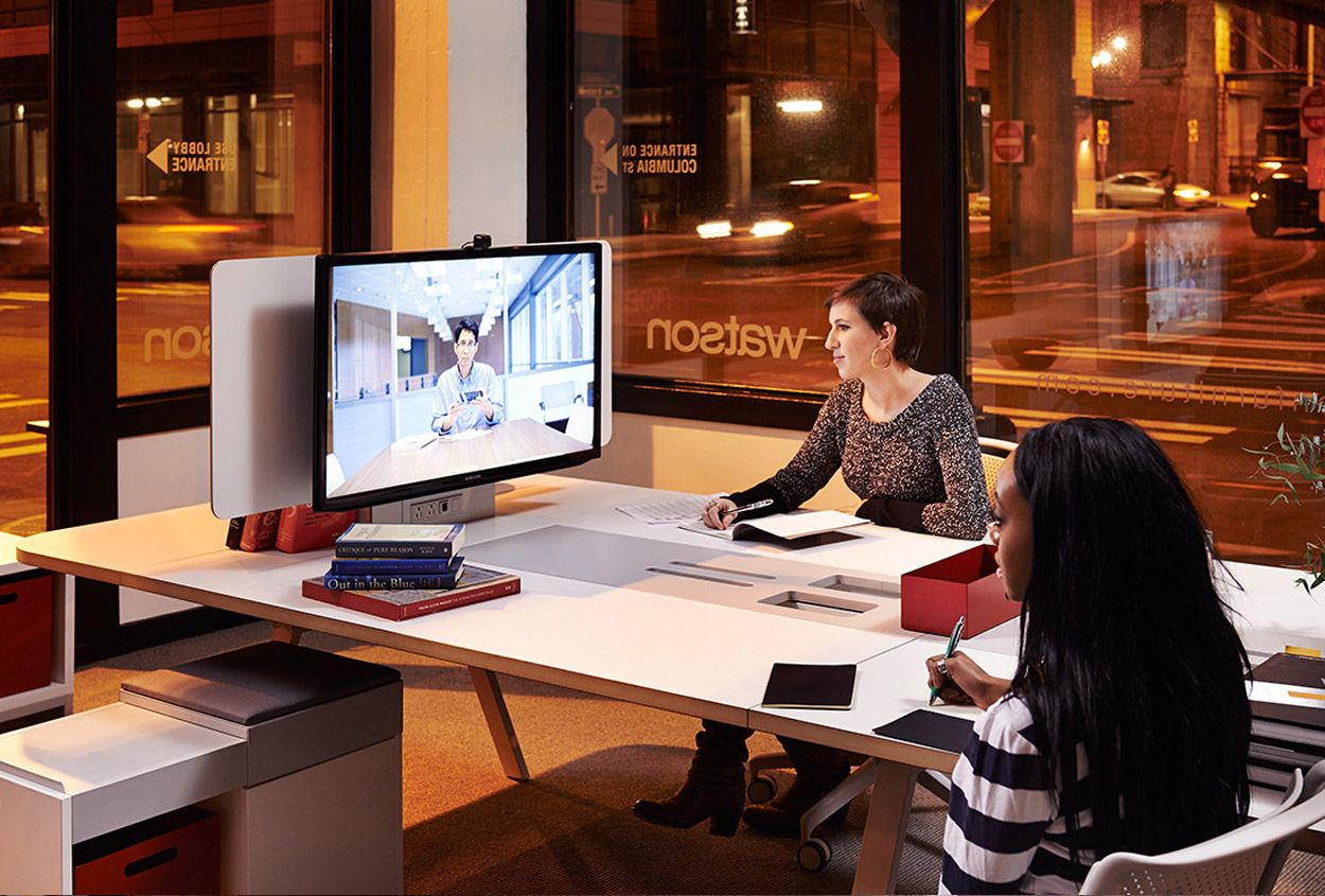
Setting the Scene
We directed a photo shoot at Watson’s HQ to ensure the site’s hero and banner regions showcased the products in a stunning and visually enticing way.


Creating A Visual Language
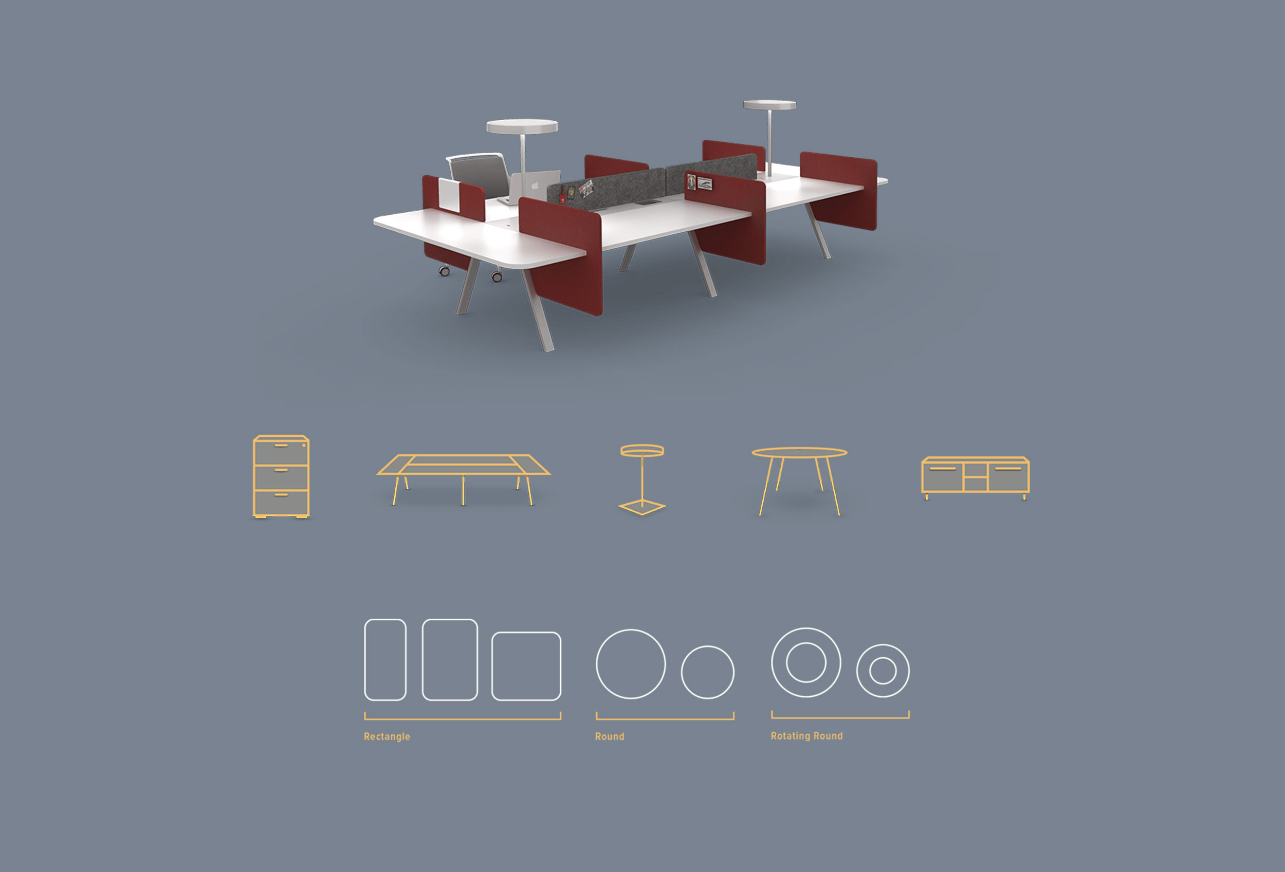
It was important that we incorporate many of their existing 3D models into the new site, so we created a new icon system that bridged the flat technical line drawings of their pricing guide with the rich dimensionality of their product renderings.

Custom Content Management
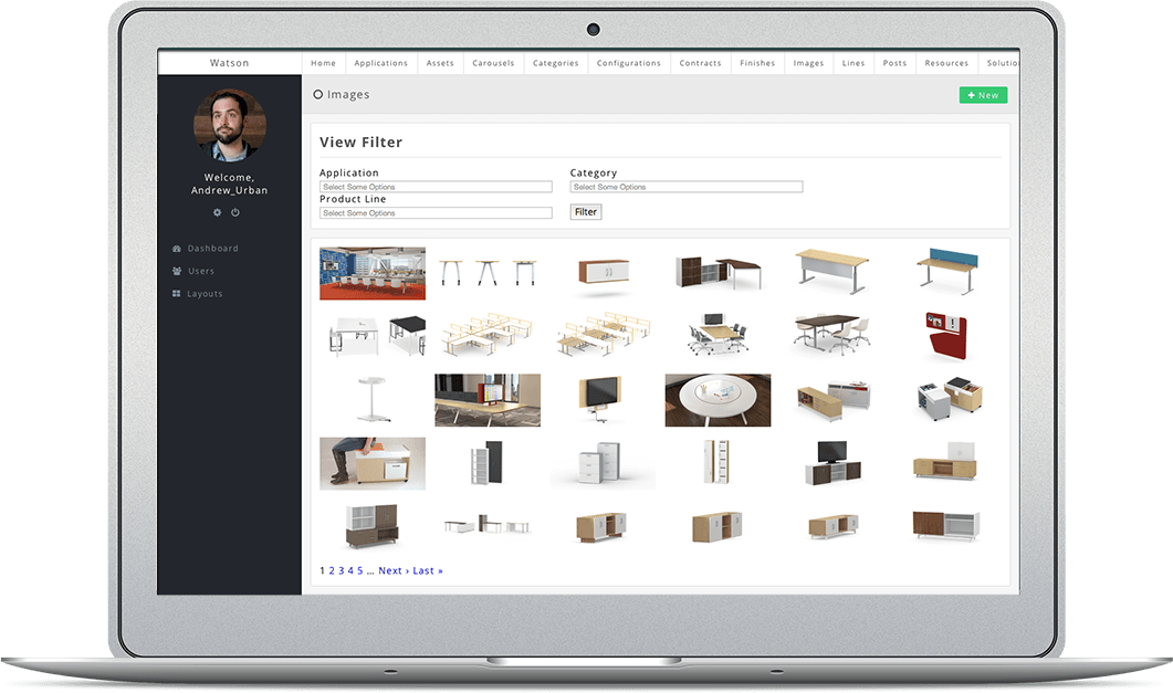
We couldn’t do is just build the site for them and expect it to last 3–5 years on it’s looks alone. Watson needed control over almost all of the site to keep the lines, as well as all the resources like finishes and configurations up to date.
We created a proprietary back-end CMS solution for Watson, from the ground up to fit exactly what they needed. We gave them extensive control while allowing on the fly layout and content adjustments.
By The Way… You’re Having Twins
Remember us mentioning that Watson had a line of furniture exclusively for Dispatch? Originally we weren’t tasked with the projects, but after seeing how well their office furniture website was turning out, they decided to revamp their other brand as well!

